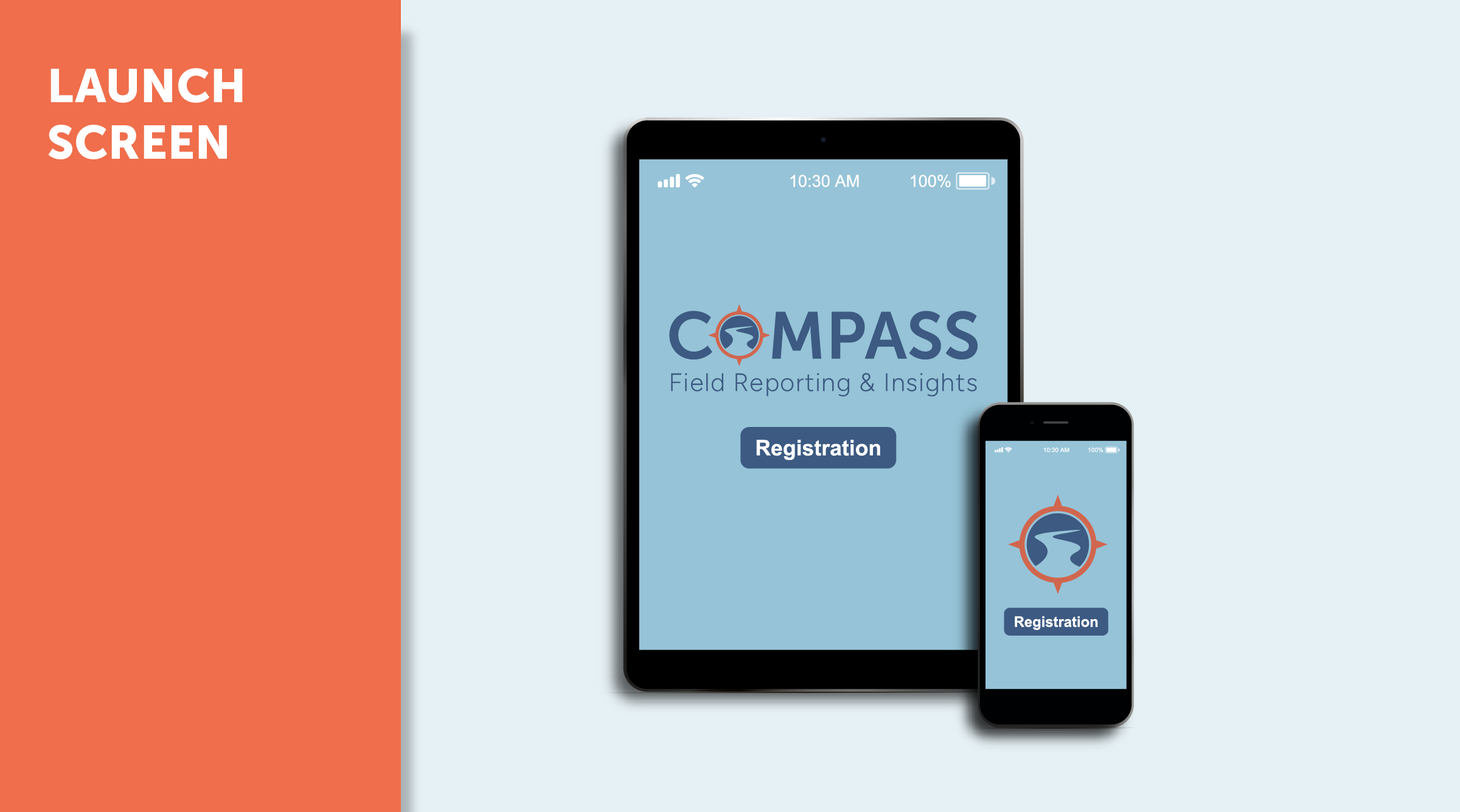
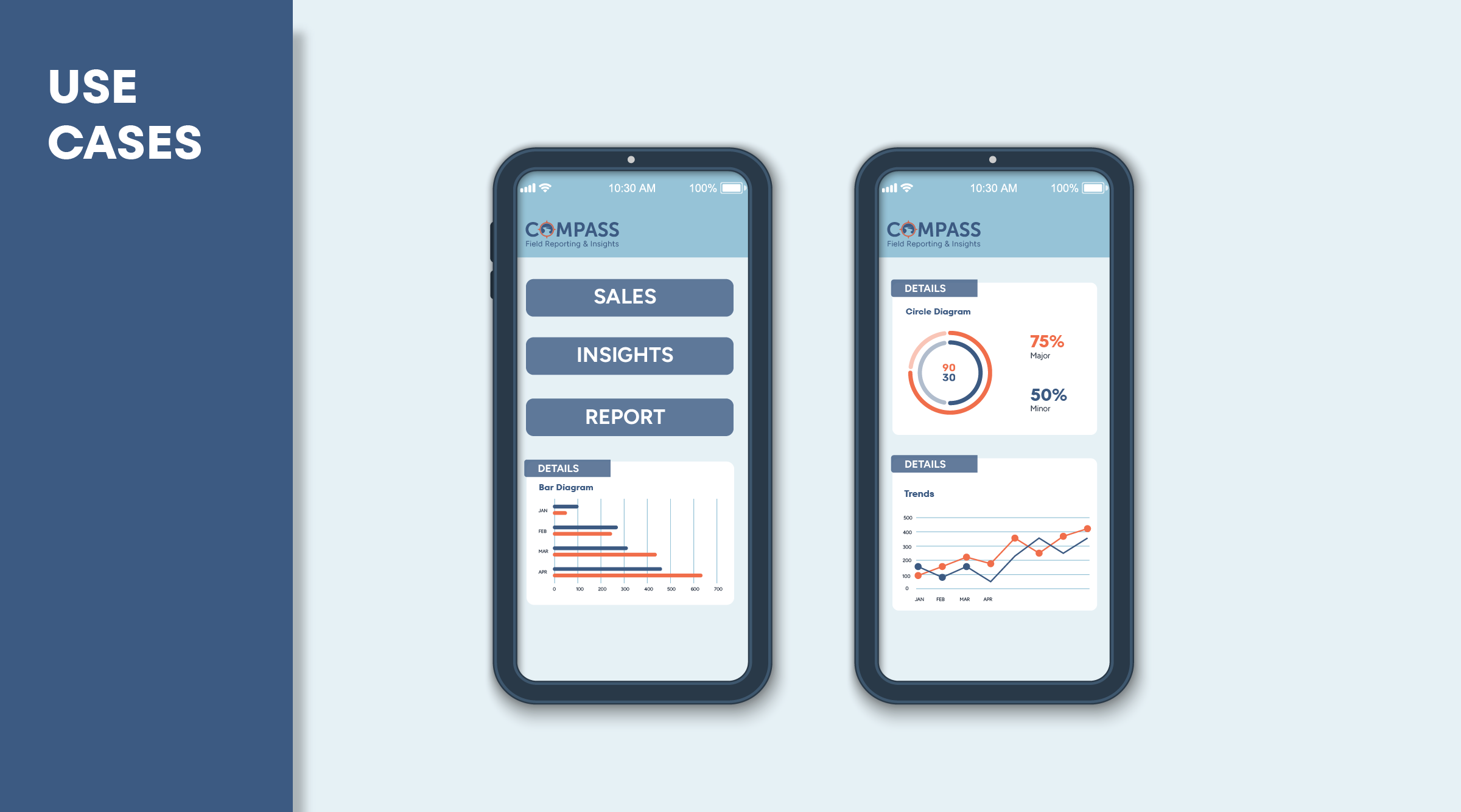
COMPASS - Brand Identity
COMPASS is a reporting and analytics application designed to help decision-makers navigate complex data with clarity and confidence.
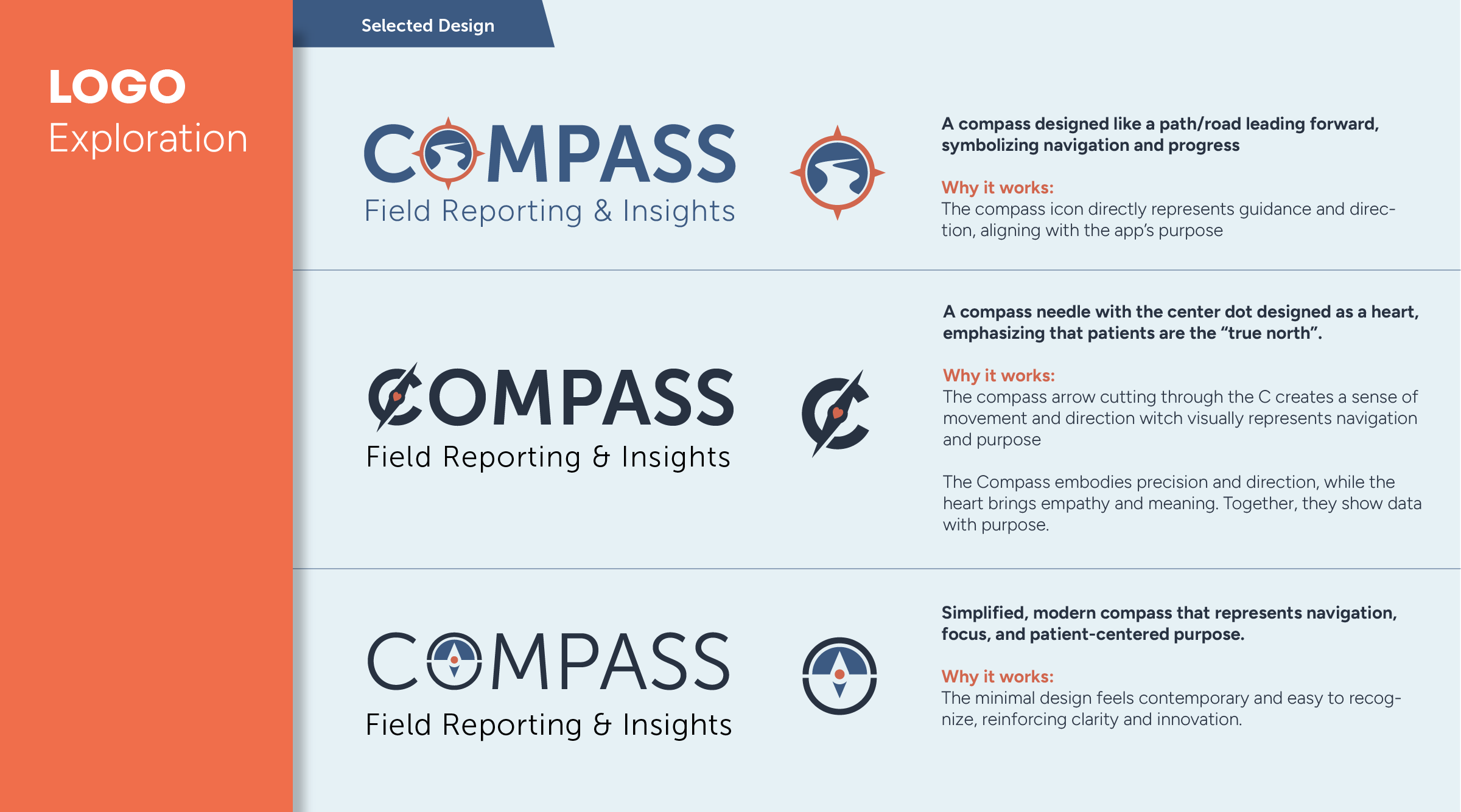
Inspired by the concept of a compass, a navigational tool that always points toward true north, the visual identity was crafted to reflect direction, clarity, and purposeful guidance. True north, in this context, symbolizes the patients and outcomes that matter most to the business.
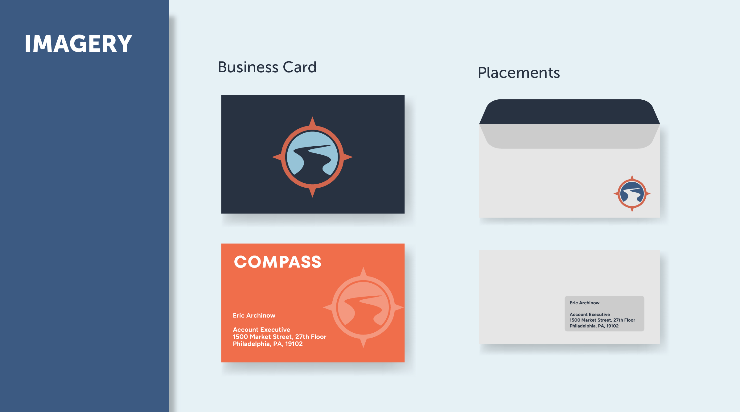
I led the brand identity development from concept through visual execution, focusing on translating the strategic metaphor into a cohesive visual language that supports user orientation and trust within the product.
Design Approach
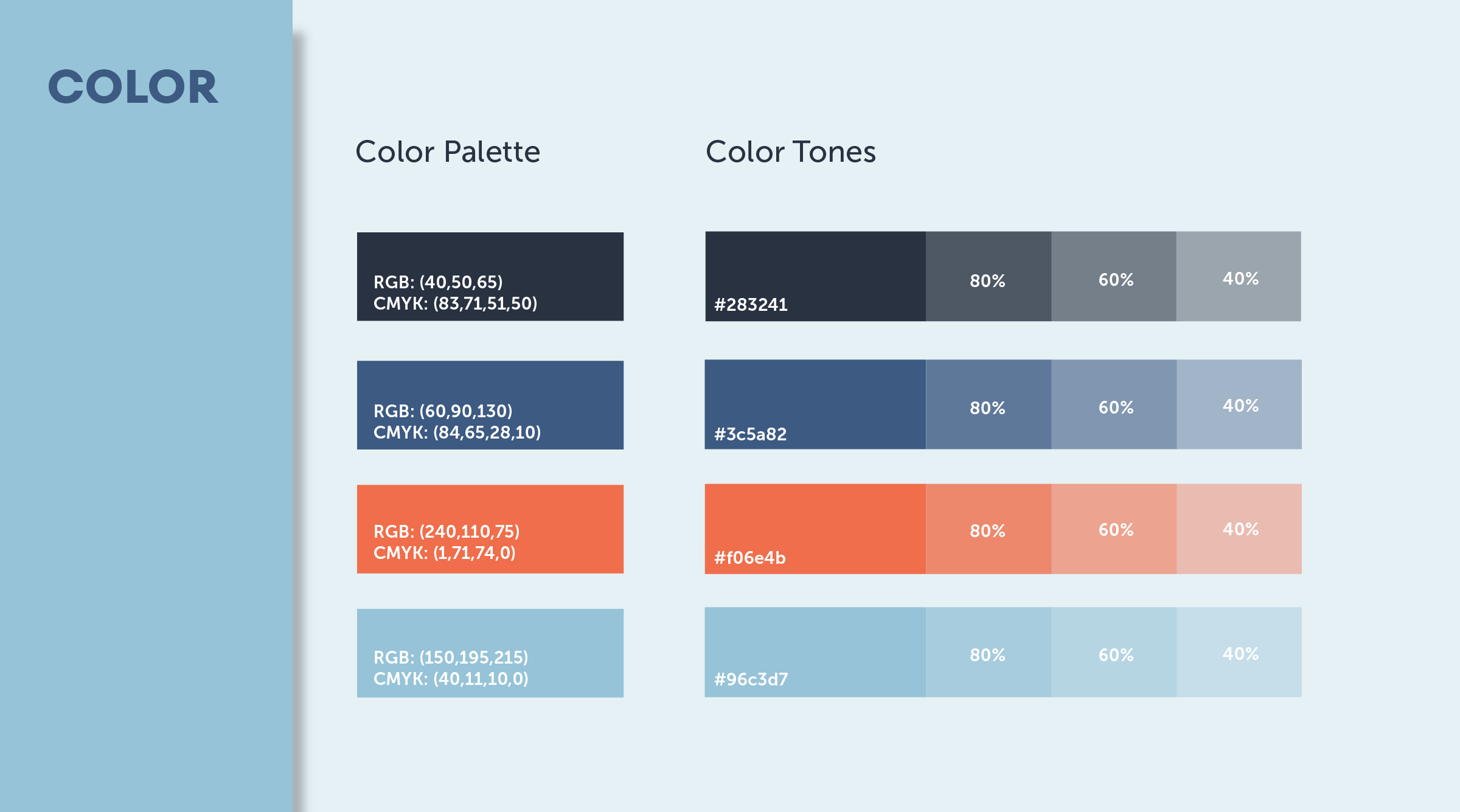
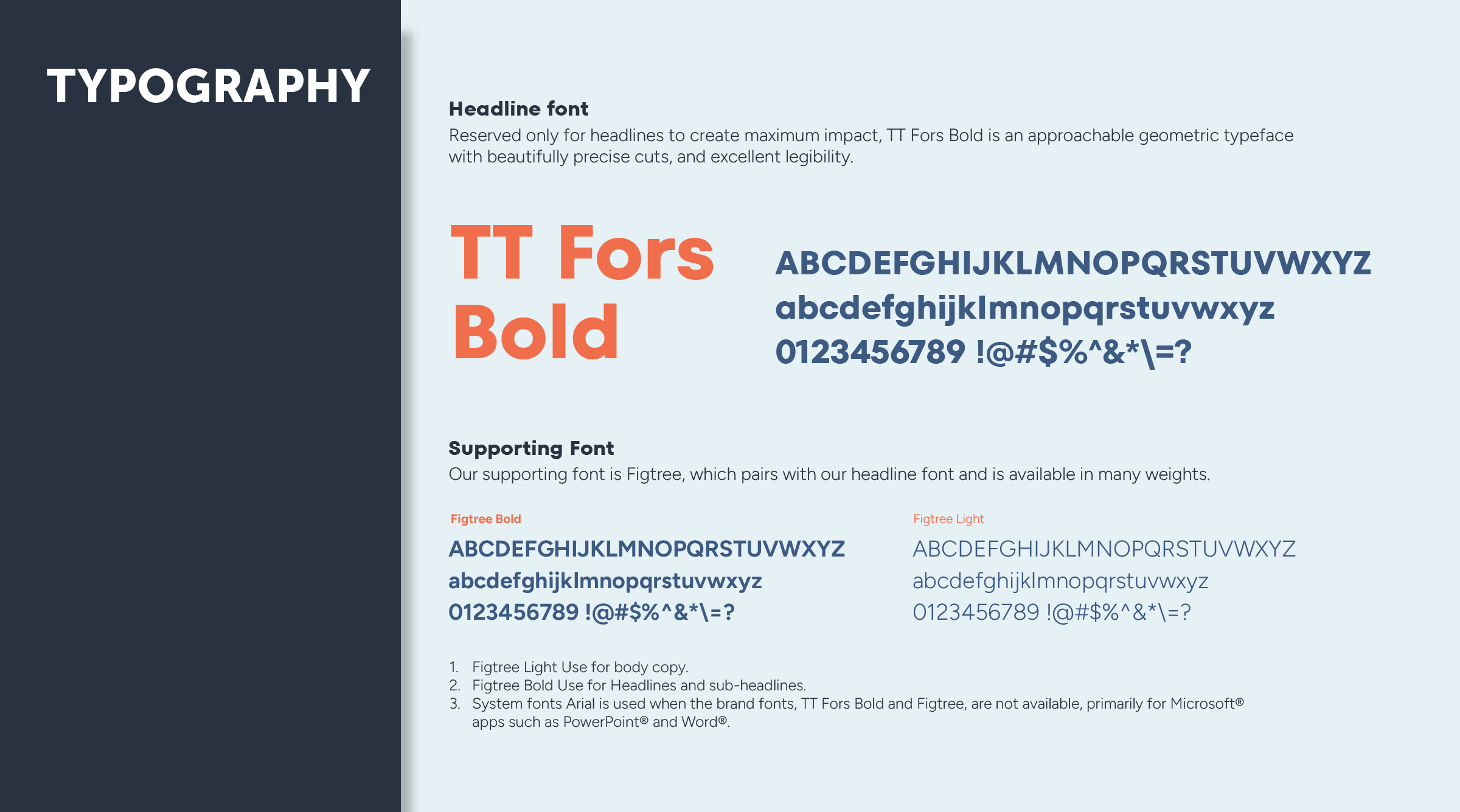
The visual identity uses geometric forms, radial balance, and a restrained color palette to evoke precision and directionality. The logo mark abstractly references a compass dial, emphasizing alignment and clarity. Typography and color decisions prioritize legibility and hierarchy, ensuring that data and navigation cues feel intuitive across screens.