Brief
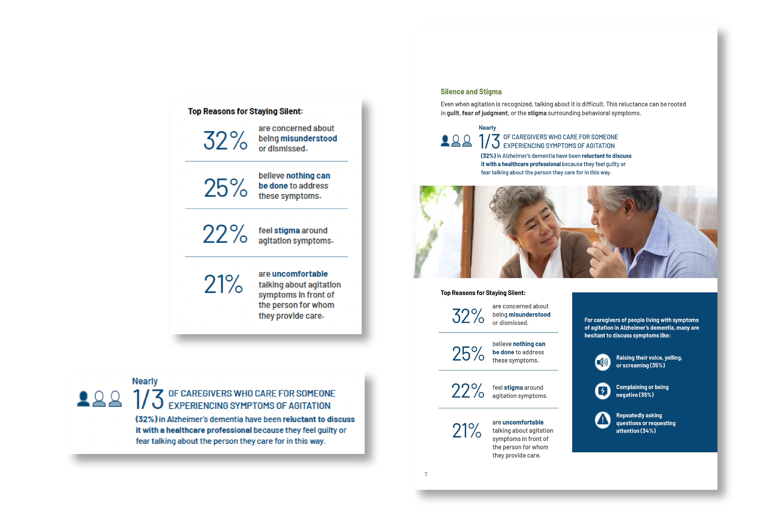
Design a series of infographics for a healthcare report focused on agitation in Alzheimer’s care. The objective was to translate complex clinical research and caregiver data into clear, visually structured storytelling that could be quickly understood by caregivers, clinicians, and healthcare stakeholders.
The infographics needed to feel credible, empathetic, and highly scannable, while working cohesively as part of a larger report.
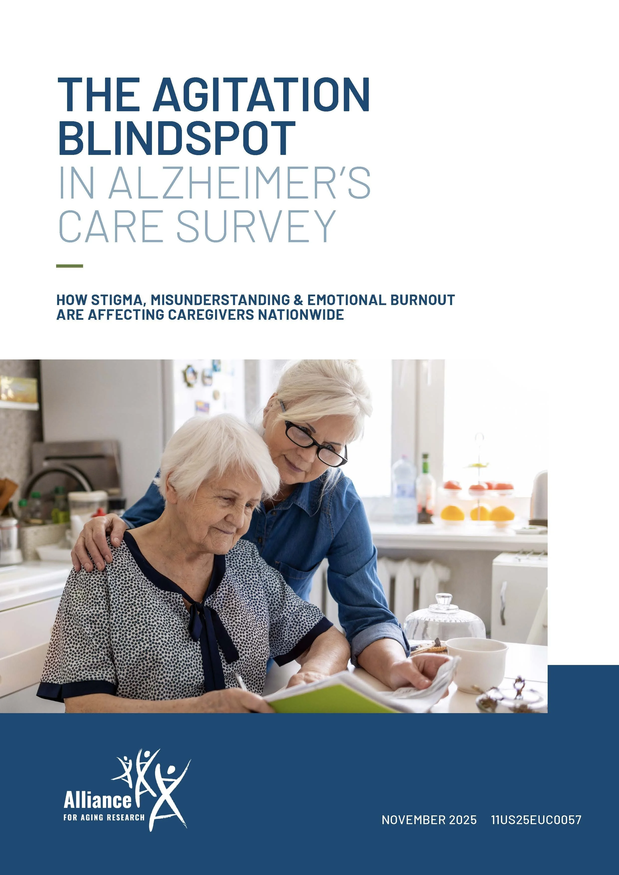
Project: The Agitation Blindspot in Alzheimer’s Care
Challenge
The content was dense, emotional, and inconsistent in how agitation was described across sources. From a design perspective, the challenge was to:
Turn multi-layered data into a clear visual system
Create hierarchy that guided readers through complex information without cognitive overload
Visualize an abstract, under-defined symptom in a concrete and recognizable way
Balance warmth and sensitivity with clinical clarity
The infographics had to carry meaning at a glance, while still rewarding deeper reading.
Solution
I approached the infographics as a visual system, not individual charts.
Information & Visual Strategy
Defined clear content groupings to organize behaviors, prevalence, and impact
Used typographic hierarchy and spatial rhythm to control reading flow
Designed iconography to represent behaviors in a human, non-stigmatizing way
Limited color palette and contrast to support accessibility and reduce visual fatigue
Paired data points with concise, insight-led headlines to make each takeaway immediate
Each graphic was designed to stand alone while reinforcing a consistent visual language across the report.
Result
The final infographics transformed complex healthcare data into a structured, approachable visual narrative. The designs:
Made an under-recognized issue visually tangible
Improved scannability and comprehension for mixed audiences
Created a reusable infographic framework for future educational materials
Supported clearer conversations around agitation in Alzheimer’s care