Project: Clinical Infographics Redesign
Brief
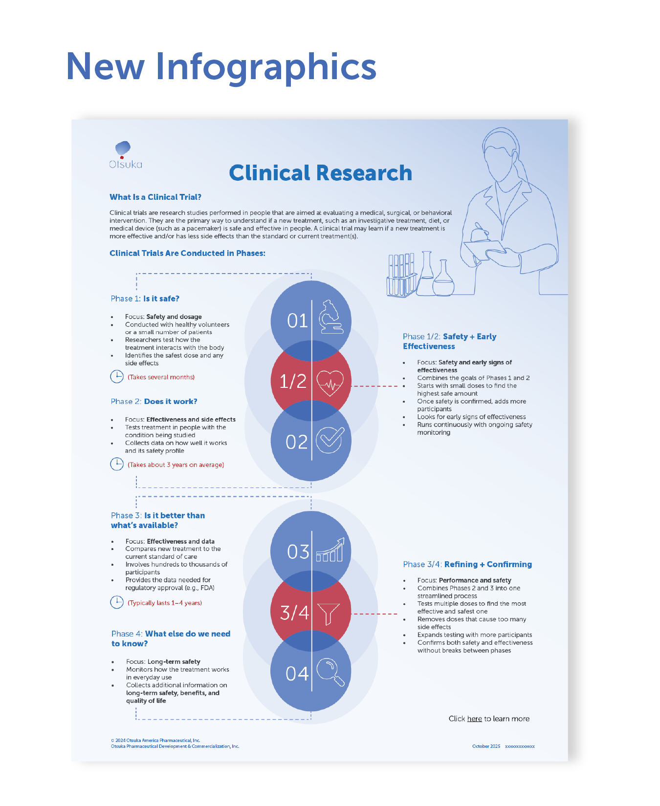
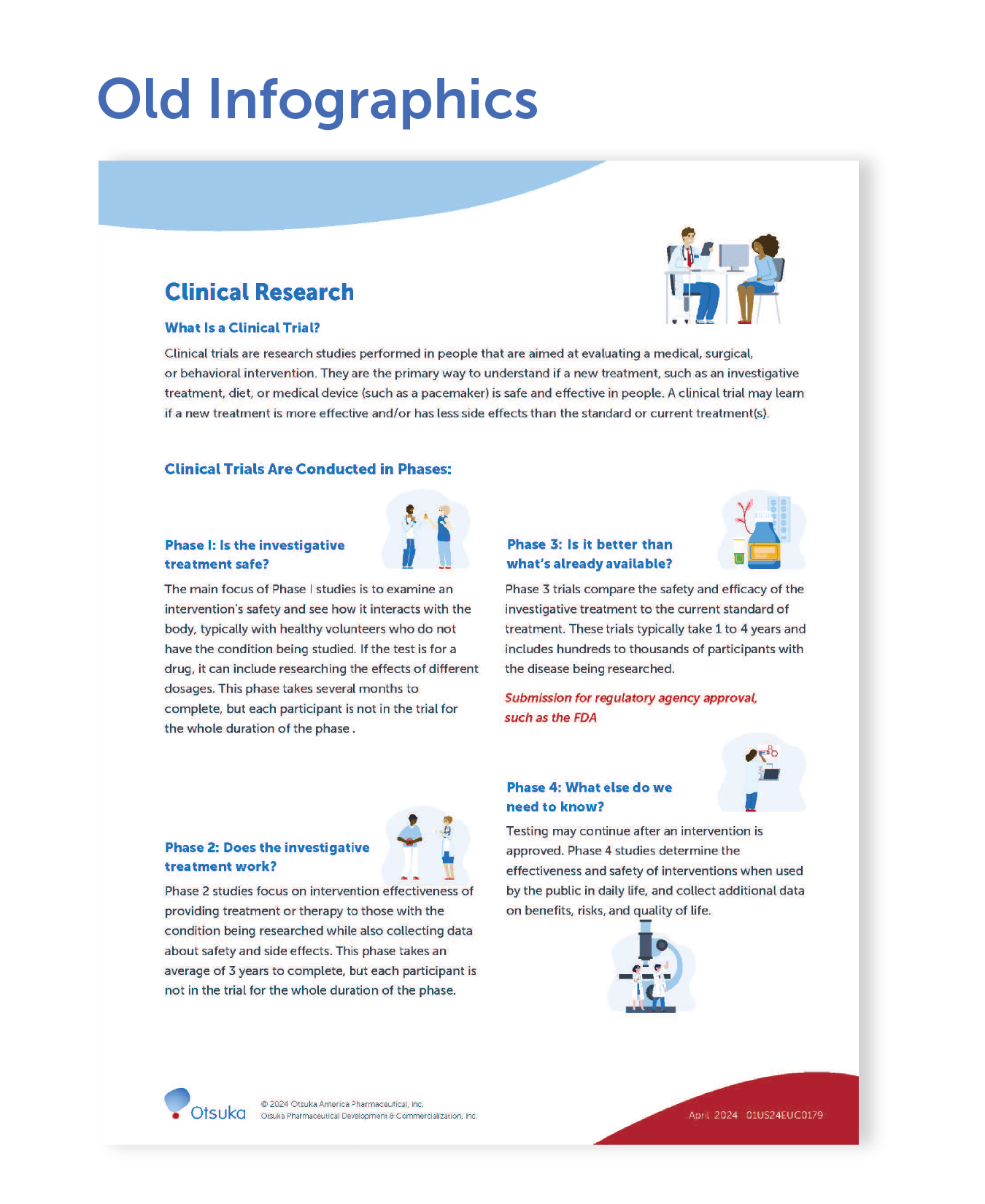
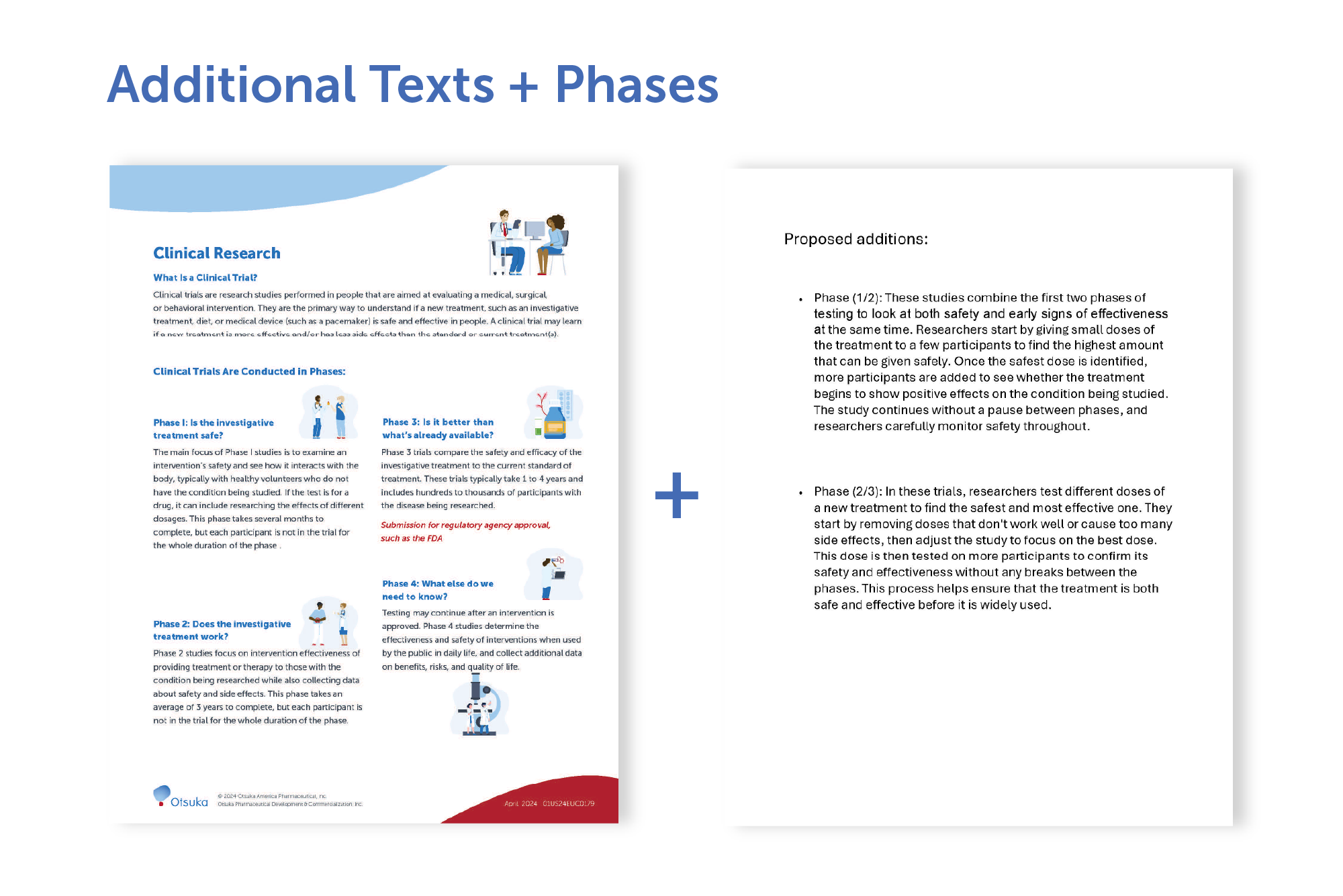
Redesign an existing clinical infographic that outlined the four traditional phases of a clinical trial (Phase I–IV). The new version needed to introduce two additional hybrid phases—between Phases I & II, and Phases III & IV—while remaining clear, visually intuitive, and printable on a single letter-size page.
Challenge
Adding two hybrid phases introduced overlapping characteristics and significantly more content. The main challenge was to clearly communicate these overlaps without overwhelming the viewer, while maintaining a clean layout that fit within strict space constraints.
Solution
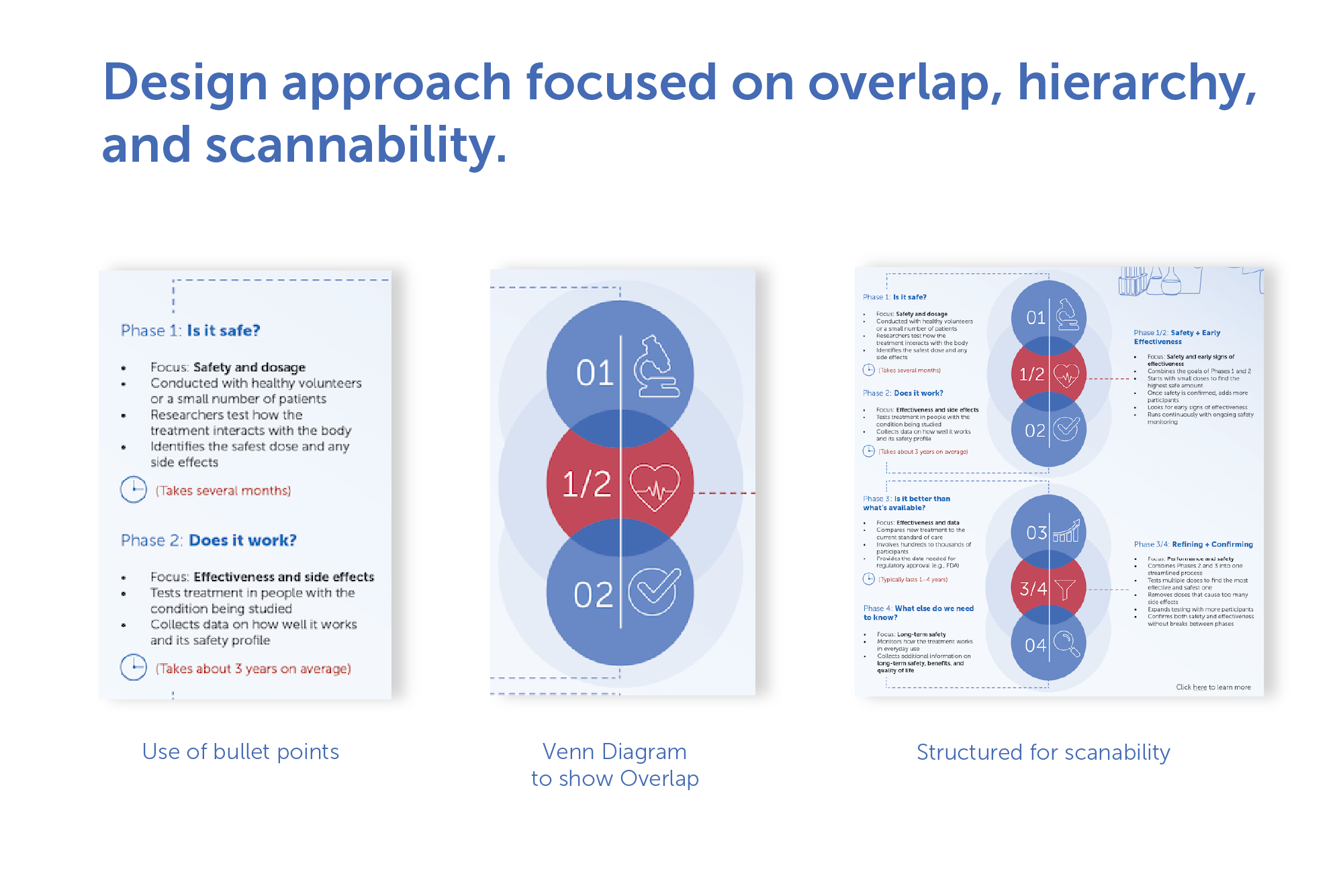
To manage the increased complexity, I restructured the content by replacing long explanatory sentences with concise bullet points that highlighted the core focus of each phase. Each phase was also given a short, bold headline to improve scannability and establish a strong information hierarchy.
Visually, I leaned into the concept of overlap by using a Venn-diagram-inspired approach, allowing shared traits between phases to be immediately understood. Color, typography, and hierarchy were used intentionally to guide the reader through the progression of phases and distinguish standalone versus hybrid stages.
Result
The final infographic presents complex clinical information in a way that is easy to read, intuitive to understand, and visually cohesive. The imagery supports the content rather than competing with it, and the design successfully balances clarity, hierarchy, and spatial efficiency within a single-page format.